
Read by JANE
My Role: UX Research, UX Design, UI Design
Read by JANE, formerly known as BookComb, is a new way to classify and categorize books past the current genre system and use it to help readers discover more personalized book recommendations. The founder behind this algorithm consulted two other UX Designers and I with the goal of fleshing out her two feature ideas, a filtered search and book recommendation engine, as well as build the beginning of her brand.
CHALLENGE
Readers want more individualized book recommendations that coalesce their favorite genres, personal interests, preferences, and mood. Current book categorizations focus too much on the genre or are not nuanced enough.
How might we help users generate and maintain an awareness of books that concisely meet her unique search criteria?
USER RESEARCH
Before beginning user interviews we had many ideas about our would-be-user: a super-reader. Super-readers typically read about 10 or more books per year, however, this brought up several questions. All questions revolved around how they differ from average readers. With the idea that super-readers and average readers may differ in their shopping and reading habits, we wanted to explore both types of readers in user interviews to determine their habits and behaviors in book discovery, purchase, and overall what influences their decisions.

We interviewed a total of 17 users; 12 super-readers and 5 average readers. We sorted all of our data into an affinity map to better understand and organize our notes.
We were able to develop a number of insights from the common themes and trends, a few shown below:
Although readers believe that book tastes are highly subjective, they value the opinions of their peers.
Readers engage in research before reading or purchasing a book.
Readers consult authoritative sources for book recommendations.
Readers want to know what the popular books are but do not assume it means they’re good.
With the insights above we were able to form a persona, the primary representation of our user. Meet Maya, the Architect, New Yorker, and frustrated book lover.
MAYA | THE ARCHITECT

She wants recommendations personalized to her interests, taste, and mood.
She needs a variety of options in her book choices.
She is frustrated when she reads a bad book, so she does due diligence.
To understand the issues Maya faces we mapped out her user journey. Through combining all of our interview notes and stories we found three common themes about a readers’ discovery process; passive, active, or a combination of both.

ACTIVE
Users research books for specific qualities.

PASSIVE
Browsing books as a part of leisure activity.

COMBO
Users shift between phases to find a book.
For Maya’s user journey we honed in on the final process of the combination of passive and active discovery. This enabled us to model the most common process as well as the most amount of problems a reader faces.
Maya’s journey goes from not knowing she was looking for a book, to receiving a recommendation from a friend, searching for a book that meets specific criteria and eventually landing back on the recommended book and purchasing it.
After mapping this out some clear areas of opportunity came to light for our client BookComb, a few shown below:
Connect Maya to friend’s book recommendations
Help Maya remain aware of books she wants to read
Connect Maya to books based on her specific interests
Provide Maya with curated recommendations
DESIGN

After validating our clients two feature ideas, we went into design studio where we were joined by the founder of BookComb. The rapid creation and iteration of several ideas in a collaborative space helped us land on one cohesive design.
MVP Product Features
Enhanced search
Recommendation engine
Curated lists
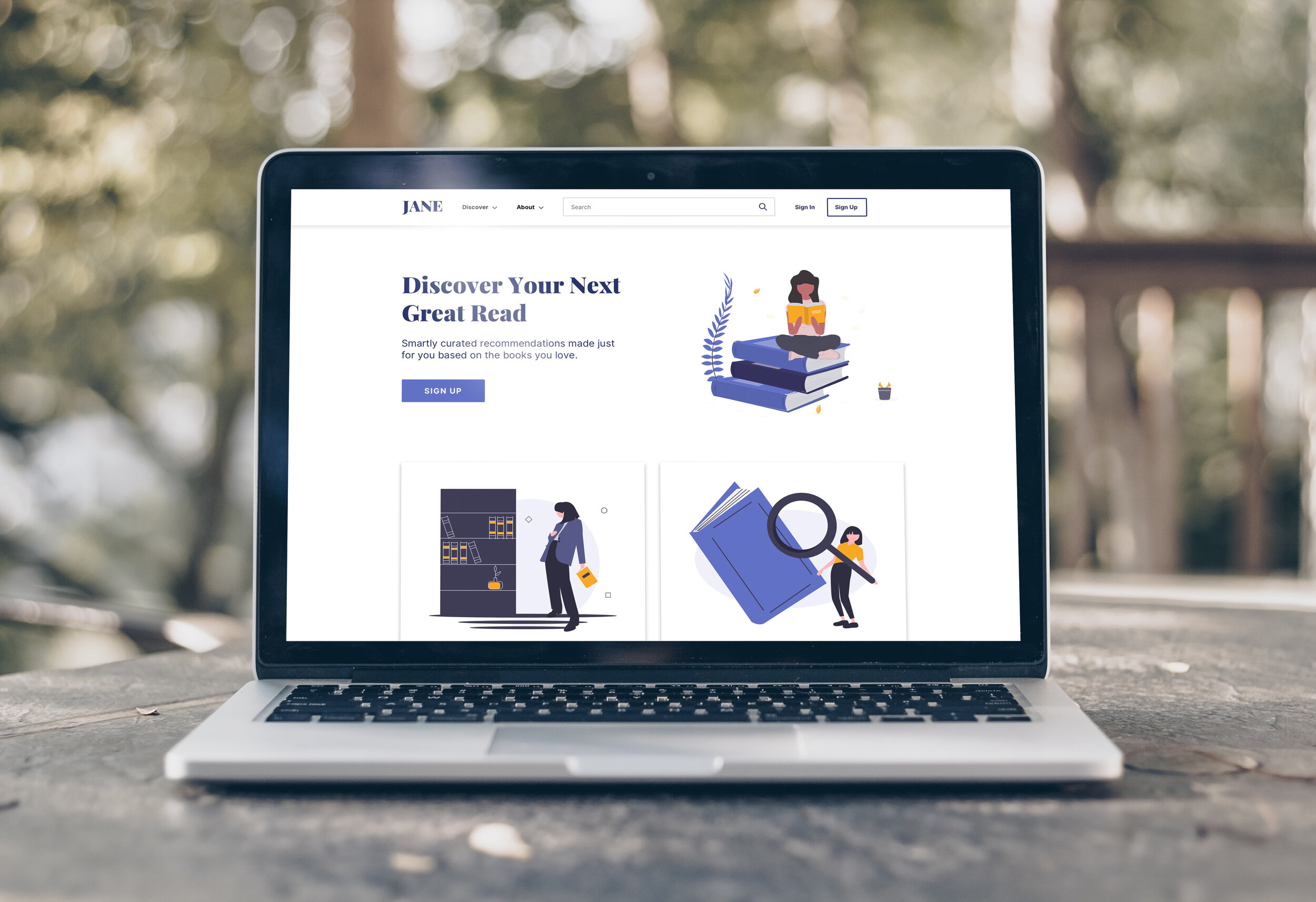
READ BY JANE

NAME
It represents a matchmaking system for readers and books, much like Jane Austen was for the characters in her novels. Also, it elicits the feeling that book recommendations are coming from someone who has read the book before.

GRAPHICS
For JANE’s graphics and illustration style, we leveraged these free graphics online to create a friendly tone within the interface.

FONTS
Our typeface choices consisted of the two shown above. Playfair was strictly used for the name and logo and inter was for the rest of our copy.

ENHANCED SEARCH
A search feature enhanced to find books aligned to specific sensibilities & interests.
RECOMMENDATION ENGINE
Book suggestions based on books you love.

TESTING
Before landing on JANE and a brand look, we had to complete a few rounds of usability testing to understand the ease of use of the home page and the two features. This was done in three rounds of testing, the first two in mid-fidelity and the last in high-fidelity. All tests were focused on our clients two main features, the filtered search and the book recommendation search, in order to validate or invalidate them.

Mid-Fidelity Usability Test Results
TEST TAKEAWAYS:
Users were confused by the names of each feature provided by the client
Overall the home screen was well received
Users were unclear on what to do during each task
Users did not understand the categorization of the filters
Users thought the book recommendation feature was too long of a process

High-Fidelity Usability Test Results
TEST TAKEAWAYS:
Users responded well to the new feature names; recommendation engine and enhanced search
Users still find the enhanced search to be difficult
Users expressed that they would not use the recommendation engine every time they look for a book due to the granularity level
Users want to use the search bar in both tasks
LOOKING AHEAD
Although we updated a ton between rounds of testing there is still a lot that needs to be done. Before launching our client will need to engage in more testing, as well as consider adding features to her MVP product as we continuously heard that users would not want to use these features without being able to save their information to a personalized profile.
SCREENS
Mobile site
Sign-in
User profile
Book product page
User lists (favorites/wish list)
Search bar
TESTING
Test from signed-in perspective
Recommendation engine as an onboarding experience
Tree study and/or a card sort for the filter classification system
Test in a personalized environment where users can choose their own favorite books, and filters
CONSIDERATIONS
User-to-user messaging
User generated reviews and ratings
Expand beyond elite books and have more variety in product offerings